
The Natural Range: Staining & Maintaining
BLOG The Natural Range: Staining & Maintaining Category Tag DATE: 01.01.01 THIS AREA WILL REQUIRE A SMALL AMOUNT OF COPY.SUMMARISING WHO YOU ARE, YOUR CORE

Your cart is currently empty.
Choosing the right cladding colour combination can completely transform a building’s exterior. The right pairing creates contrast, depth, and architectural interest. The wrong one can make even a well-designed property feel flat or unbalanced.
If you’re planning a renovation, extension, or new build, here are five timeless cladding colour combinations that consistently deliver strong visual impact.
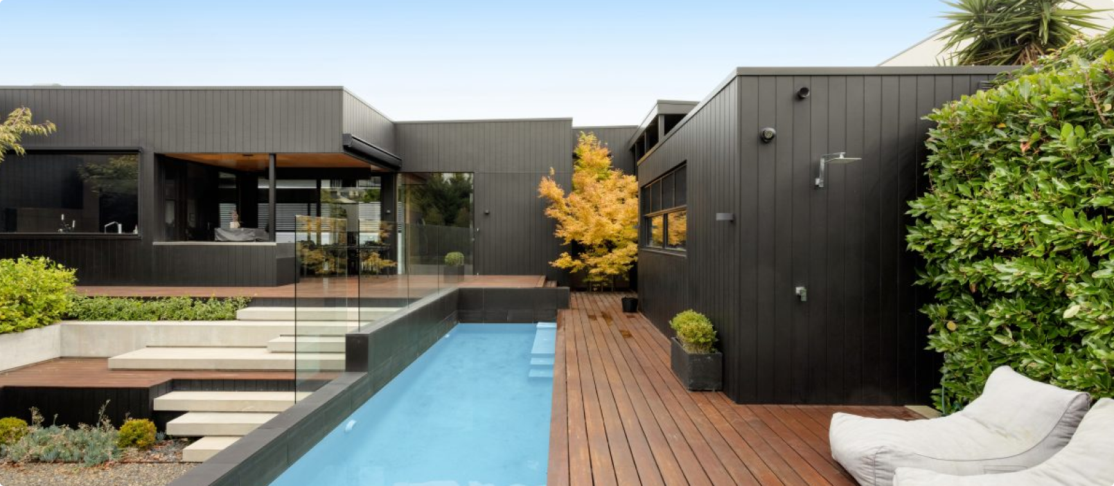
This combination balances modern sophistication with warmth. Dark charcoal tones create a bold, architectural backdrop, while natural timber softens the look and adds texture.


Best for:
Design tip:
Use charcoal as the primary façade colour and introduce timber in recessed areas, around entrances, or as vertical feature panels.
This look is heavily influenced by Scandinavian architecture, particularly design trends seen across Sweden, where contrast and natural materials are key principles.
Clean, minimal, and timeless. White keeps the property feeling bright and modern, while light grey adds subtle depth without overwhelming the design.


Best for:
Design tip:
Pair smooth white panels with lightly textured grey cladding to create visual variation without introducing new colours.
This combination is especially popular in contemporary residential architecture throughout Melbourne, where sharp lines and neutral palettes dominate.
Muted green tones feel natural and calming while still offering personality. Off-white trims or panels prevent the design from feeling too heavy.

Best for:
Design tip:
Choose a soft, desaturated sage rather than a bright green to keep the look sophisticated and timeless.
This palette works particularly well when paired with landscaping and natural stone features.
BLOG The Natural Range: Staining & Maintaining Category Tag DATE: 01.01.01 THIS AREA WILL REQUIRE A SMALL AMOUNT OF COPY.SUMMARISING WHO YOU ARE, YOUR CORE

Sign up for exclusive Weathertex tips and trends sent straight to your inbox